The Power of CTA’s. Know how to use them
The only thing that interests us as a marketer or an entrepreneur after putting together the marketing strategy and creating a website, is the lead-conversion rate. The conversion of an individual from a mere website visitor to a regular customer depends on how attractive and dynamic you develop the call to action (CTA’s).
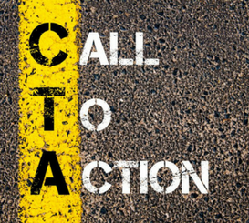
What is a call to action (CTA)?
Call to action or CTA are buttons, texts, and links found on our website. Its main function is to motivate and persuade a potential client to convert into a final customer.
Therefore, if you have a good call-to-action set up on your site, it will favor the content to promote or communicate and this will generate more conversions on the site.
Because the user’s decision always has the possibility to get changed in a moment or two, we must apply the psychology of attraction while designing a creative or compelling CTA for you. But many of the web designers find it tough to develop a CTA that will pinch the user to convert into a customer. So, is it really impossible to create a call-to-action that matches your consumers’ perception? Not really, however, it is tough.
How to apply psychology in call-to-action?
It’s really important to understand the psychology of call to action because it will take the effectiveness of our marketing to a higher level. You might have seen a number of different creatively designed CTAs in many websites but do all remain successful in lead conversion? Gone are the days when people would instantly love the different thing amongst the rest. Web users have become smart now; they do not want to see something much creative or unique but something relevant and easy to use. So when the users enter a website they love to see something that is unique and relevant.
They no longer want you to sell the product directly or ask them for their information, without first giving them something in return.
No more CLICK HERE! BUY HERE! SEE MORE! Such CTAs are considered spammy today.
These same old tactics make the probability of them contact you through the CTA is almost nil. Now, understand what they expect to see when they enter the link or why they should click.
When they enter the page, they are eager to find valuable and informative content. People like to see more of something, that’s enticing. So, When they reach your site, there must be a message that persuades them to do something more and get much more valuable information than they expect. If they do not find any insurance through CTA they will leave your website and move on to some other site that can give them better information.
In short, users are always waiting for for the content that appeals to them.
The secret of an effective CTA is that it is very simple and easy to understand. The user values the appearance of what he sees, which is why the final appearance is very important.
The size and shape of the CTA’s are also one of the aspects that the user will consider to click faster, the bigger the better, since it is more visible.
Communicate a benefit from the beginning. The user is always interested in getting exclusive information, hence, be direct and transparent. Tell the user what to do, the more direct you are in the CTA, the better it is for the conversion.
Position the CTA correctly within the page and so the user can see it quickly.
Identify who your target audience is, CTAs will not always work the same for all users. In addition, this will depend on the objective you want to achieve, whether it is to attract new subscribers, download premium content or request a quote. To be precise, it is very important to have a meaningful design.
Less is more! An effective CTA must have a maximum of 140 – 150 characters, otherwise you will go unnoticed, so you must be punctual with the offer you make.
The colors to use in call-to-action are very important because not all have the same meaning or are not well perceived by users. Use the correct color that is consistent with the content and offer to communicate.
We all like the words FREE, OFFERS, DISCOUNTS, and PROMOTIONS, so highlight these words in your CTA.
Finally, when the CTA is live on your site keep monitoring the ROI . If needed keep improving it on regular intervals.
Do not forget the fact that making a call to action is not just creating a color button with a short message, but it is a process in which you must be prepared to attract more visitors and turn them into potential customers.


CTAs with not just the catchy content but with attractive design and placement is what required to grab user attention and compel them to take the action. So, collaborate effort of both designer and writer is required to come up with a successful CTA.